Interest rates fell significantly in the first quarter; 30-year Treasury yields dropped from 3.01% to 2.81% while the 10-year Treasury shaved roughly 19 bp’s to end the quarter at 2.49%. A flatter yield curve contributed to longer bonds outperforming including a notable, albeit brief, inversion of the 3-month vs. 10-year Treasury. Other sections of the Treasury curve, including the 2-year vs. the 5-year, continue to be inverted. High yield bonds rallied significantly tracking equity indices higher.
Review
The table below summarizes the returns of some major BofA/Merrill Lynch fixed income indices.

AAA Yield Shifts
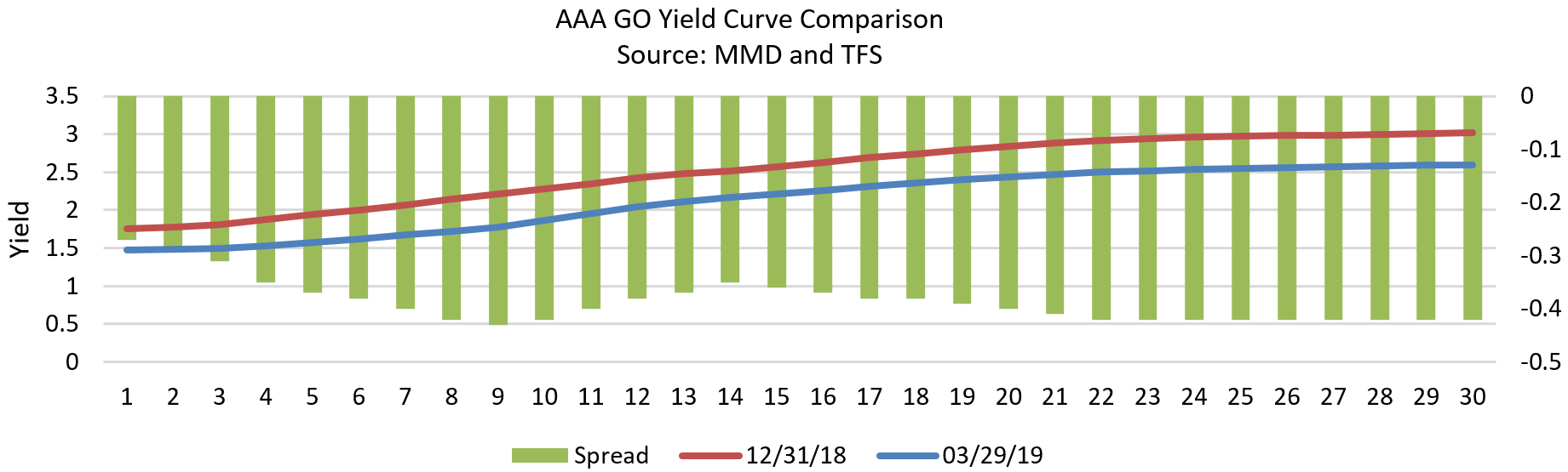
The chart below shows the shift in the yield curve for AAA-Rated Munis since the first of the year. The red line shows the yield curve as of 12/31/18 for maturities from 1 to 30 years. The blue line shows the yield curve as of the end of the first quarter. The yields associated with the curve are shown on the left axis. For example, the yield of a bond with a 1-year maturity went from 1.75% to 1.48% during this time period. The vertical lines on the chart represent the change in yields for each given maturity. This change is shown on the right side of the chart. For example, the yield of a bond due in 9 years fell 43 bp’s during the quarter. This chart shows we had a significant rally in the Muni market.
Should We Be Concerned About Inflation Picking Up?
The Financial Crisis occurred more than 10 years ago and peaked after Lehman Brothers collapsed on 9/15/2008. Since early 2009 the economy has been in a steady uptrend. During the early years of the crisis the Fed implemented several policies to help stimulate the weak economy. These measures included taking the Fed Funds rate to zero. When that didn’t appear to be enough stimulus to strengthen the economy, the Fed implemented three rounds of Quantitative Easing by purchasing extraordinary amounts of U.S. Treasury securities. This resulted in their balance sheet going from about $800 billion to about $4.5 trillion. During this period the Fed faced extraordinary deflationary forces and was not able to reach their inflation target of 2.0% until recently. The bond market has become complacent after more than 10 years of extremely low inflation. Negative demographic trends and high levels of debt have been a drag on economic growth and led to inflation being below the Fed’s 2.0% target. Market breakeven rates are currently around 2.0% which suggests the bond market expects inflation to average about 2.0% annually for the next 10 years. There are some signs this may turn out to have been an overly optimistic view about inflation. The tax cuts combined with increased government expenditures are leading to worrisome Federal deficits, which are projected to be over $1.0 trillion annually for the next 10 years or more. This is an unprecedented amount of fiscal stimulus for an economy at this late stage in the business cycle. The chart below shows the deficit projections by the Congressional Budget Office (CBO) through 2028. This is projected to take the percentage of debt to GDP from about 106% to 113% during the next several years. To put this into context debt to GDP was only about 30% in the early 1980’s.

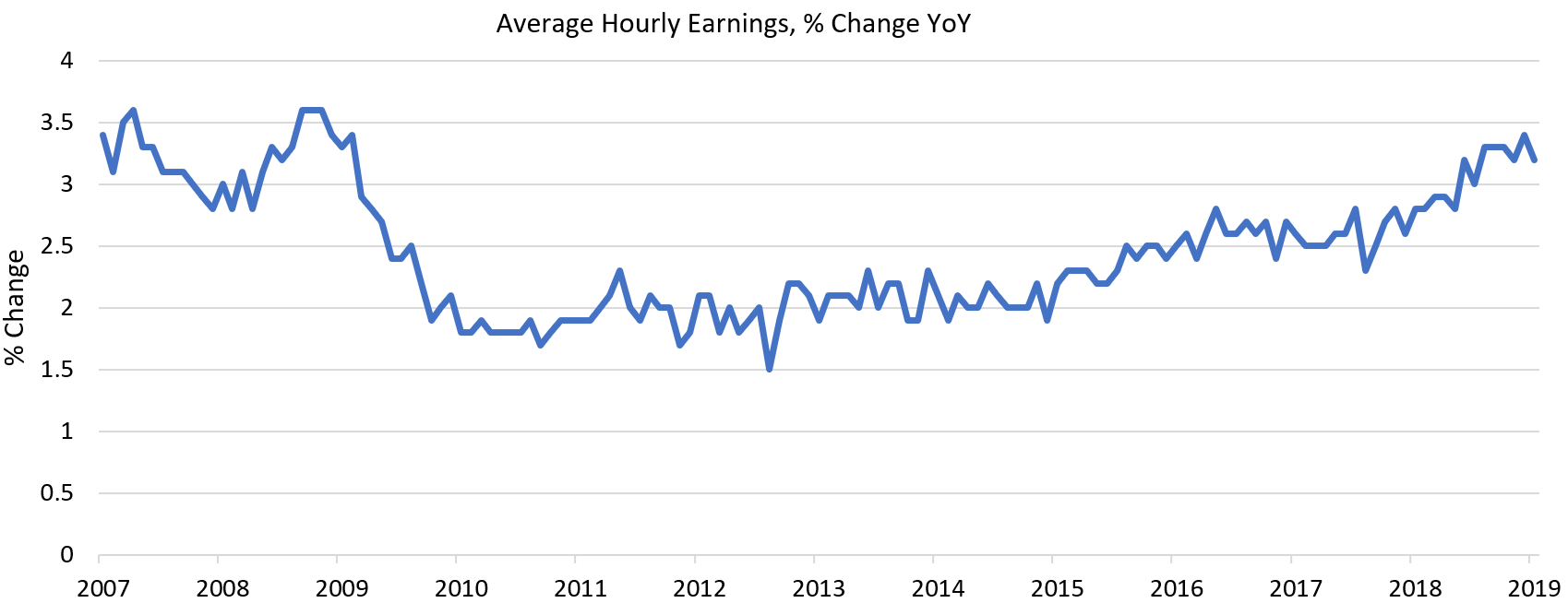
This stimulus is coming at a time when the unemployment rate is below 4.0%. The unemployment rate has averaged about 5.8% since 1948. This means there is now very little slack in the labor markets. There are shortages of available workers across many sectors of the economy. Currently, there are simply not enough construction workers for firms to hire. This is due to workers leaving the construction industry for other jobs, not enough new skilled workers entering the industry, and workers leaving the country or not being allowed to enter the country due to tighter immigration policies. This trend is not expected to change any time soon. Other industries are experiencing the same difficulties in hiring workers for their job openings. This is leading to increased wages for workers. The minimum wage is increasing in many parts of the country to $15 per hour, and this trend seems to be gaining momentum. Teacher salaries are also beginning to rise after being capped for several years due to budgetary pressures at the state and local levels. The chart below shows Average Hourly Earnings is now rising at an annual rate of between 3.0%-3.5% after averaging only 2.3% for the last 10 years. We expect wage pressures to continue to rise which will lead to higher levels of inflation going forward. This may put some upward pressure on longer rates.
Muni vs UST Ratios
Tax law changes which cap the amount of deductions for state and local real estate, property, sales, or income taxes paid over the course of the year to $10,000 have made Munis more attractive to investors who live in high tax states. This has increased the demand for Muni bonds. At the same time the limitations imposed on tax-free refunding’s in the Muni market have reduced the relative supply of Munis. This has led to Muni bonds trading at relatively rich valuations compared to U.S Treasuries and has led to outperformance by Munis across all maturities on the yield curve.